

The gender pay gap, or the observed difference between wages paid to women and wages paid to men, has been a source of economic research throughout the past several decades. Usually publicly available data such as Census Bureau reports or Bureau of Labor Statistics is used to calculate the gender pay gap. The gap is commonly demonstrated by the ratio of the median earnings of women and the median earnings of men. This ratio is calculated for all women and men wage and salary earners who work full-time and year-round. When this ratio is less than one it is assumed that the women are earning a fraction of the men's earning. For example, if this ratio of women's median earning to men's earning is .8, this means that the median earning of women was 80% of the median earning of men and therefore there was a gap of 20% between the median earnings of women and men.
It is important to note that this type of overall measurement of the difference between wages paid to women and men is an aggregate measurement and it lumps many different categories of the salary and wage earners with vastly different characteristics into one simple measure. In order to properly interpret and use such an aggregate measure one has to estimate the degree to which this aggregate measure is related to an array of possible explanatory factors. These factors may include, but not limited to, occupation, industry, education, years of experience, and other factors that relate to the differences in the career choices of women and men. Nevertheless such aggregate measures do provide useful information when simultaneously considered with other labor market information. The purpose of this paper is to demonstrate that the use of publicly available data in the gender wage gap debate is useful but it also has some drawbacks. The publicly available data is very useful in detecting and establishing the trends but the drawback is that the publicly available data usually is not rich enough to provide useful comparisons. In order to identify and correct gender-based employment decisions micro level data or employer level data is needed. In the following sections, I will describe some of the useful information that we can extract from publicly available data and also show why some of the more aggregate data could sometimes be misleading.
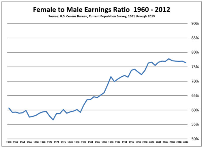
The graph below shows the gender earning gap during the time period from 1960 to 2012. The graph indicates that the gender earning gap, as defined above, has narrowed over the past 52 years. Over that time period, the ratio of the median earnings of women and the median earnings of men has risen from about 60 percent in 1960 to about 77 percent in 2012.1 Nevertheless, the raw gender earning gap in 2012 still constitutes 23 percent of the median male earnings. It is also interesting to note that the gender gap appears to be losing its trend in recent years. It will be necessary to watch this trend and see if this slow down in narrowing of the gender wage gap is due to the recent economic downturn or is a more permanent and structural phenomenon.
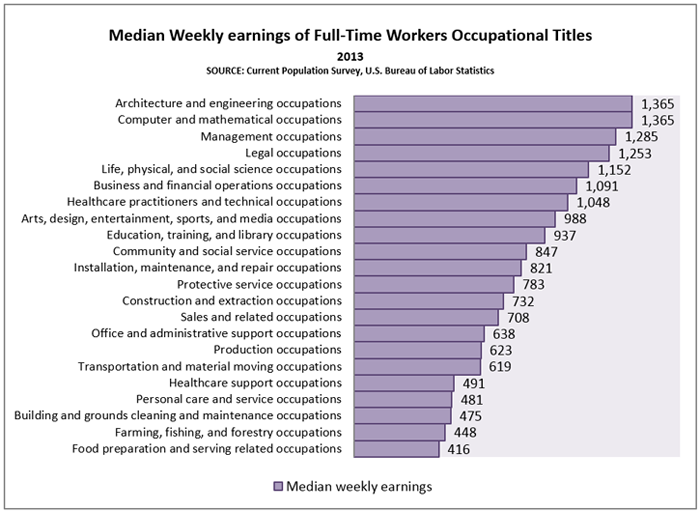
One of the major factors that influence the earning gaps is the choice of occupation by the wage earners. Different occupations command different earnings. The graph below shows the distribution of and the variation of the earnings by major occupational titles in 2013. The graph shows that the top three broad occupational categories in terms of earning are: architecture and engineering occupations; computer and mathematical occupations; and management occupations with the median weekly earnings of $1,365, $1,365, and $1,285, respectively. Similarly, the bottom three broad occupational categories are: building and grounds cleaning and maintenance occupations; farming, fishing, and forestry occupations; and food preparation and serving related occupations with the median weekly earnings of $475, $448, and $416, respectively.
Occupational segregation by gender remains widespread and studies have shown that occupational segregation explains a portion, but not the entire gender wage gap.2
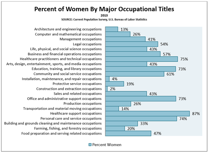
The graph below shows the percent of women by major occupational titles in 2013. While the percent of women across all occupational titles in 2013 was about 44%, women's representation in the top three occupations of architecture and engineering occupations; computer and mathematical occupations; and management occupations with the highest weekly earnings were 13%, 26%, and 41%, respectively. Similarly, women's representation in the bottom three occupational titles of building and grounds cleaning and maintenance occupations; farming, fishing, and forestry occupations; and food preparation and serving related occupations were 33%, 20%, and 47%, respectively. The representation of women in the construction and extraction occupations is the lowest, with women constituting only 2% of the labor force in that broad occupational title.
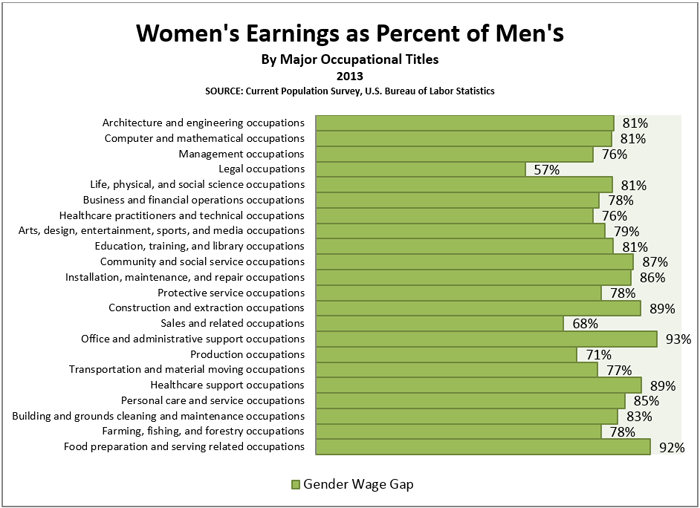
The next graph shows women's median weekly earnings for full-time wage and salary as a percentage of men's median wage and salary by major occupational titles. As expected the ratio of median earnings varies substantially across the major occupational categories.
In the office and administrative support occupations, women's earnings are about 93% of men's earnings. This means that the gender wage gap for this occupational category with no other controls is about 7%. In contrast, in the legal occupational category, women's earnings are 58% of the earnings of men. This means that the gender wage gap for this occupational category is about 42%.
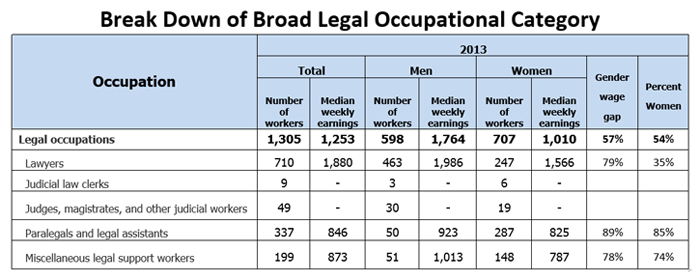
It is instructive to look at the legal occupations category and see if how the breakdown of this broad occupational category into its basic components affects the overall gender wage gap of the legal occupations category. As the table below shows among the lawyers occupation the ratio of women's earning to men's is 79% and among paralegals and legal assistants, and also among miscellaneous legal support workers, the ratio of women's earning to men's is 89% and 78%, respectively. Part of the reason why overall ratio of median earnings of women and men for the broad legal occupations is low, is because women's representation in the lawyer category, which is a higher pay occupation, is 35% but women's representation among paralegals and legal assistants occupations and miscellaneous legal support workers occupations, which are relatively lower pay occupations, is 85% and 74%, respectively.
Also note that the broad category of legal occupations includes the judicial law clerks occupations, as well as the judges, magistrates/other judicial workers occupations. Because of sample size the Bureau of Labor Statistics (BLS) does not publish the median earnings for these two groups individually; however, BLS does include the earnings of these two occupations when it calculates the overall earnings for the legal occupation broad category.
The above discussion reminds us that when we look at the calculation of women and men's earnings ratios at the broad occupational category level we must keep in mind that these broad occupational categories include many, and sometimes very dissimilar, occupations. The ratio of median earnings of women to men in each of these individual occupations may be very different than the overall ratio for the overall broad occupational category.
In fact, if we look at the BLS' table 39 (see: http://www.bls.gov/cps/cpsaat39.htm) which gives the median weekly earnings for men and women, the first row in the table (the row for total figures) indicates that it includes the median weekly earnings for about 104,262,000 full-time workers.3 Among 104,262,000 full time workers about 57,994,000 are men and about 46,268,000 (44%) are women. The overall median weekly earnings for women is $706 and the overall median weekly earnings for men is $860. Therefore, the ratio of the median weekly earnings of women to men is 82% (i.e. women's earnings is 82% of men's).4
Further analysis of the same data in table 39 indicates that this table and the above weekly median earnings ratio of 82% includes the weekly median earnings of women and men in 535 different occupations; however, BLS publishes the earning pairs for only 111 occupations.5 Therefore without access to individual level data it is not possible to assess the extent of the variation of the earnings ratios across all 535 occupations. Nevertheless, the review of the earnings ratios across 111 occupations does indicate substantial variations.
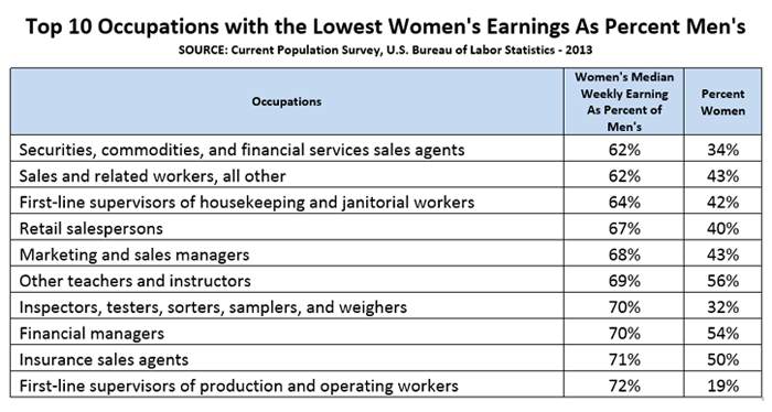
The top ten occupations with the lowest women's earnings as a percentage of men's are listed in the table below. In securities, commodities, and financial services sales agent occupations women's representation was 34%, but their earnings were only 62% of men's. Similarly, in first-line supervisors of production and operating workers occupations women's representation was only 19%, and their earnings were 72% of the earnings of men.
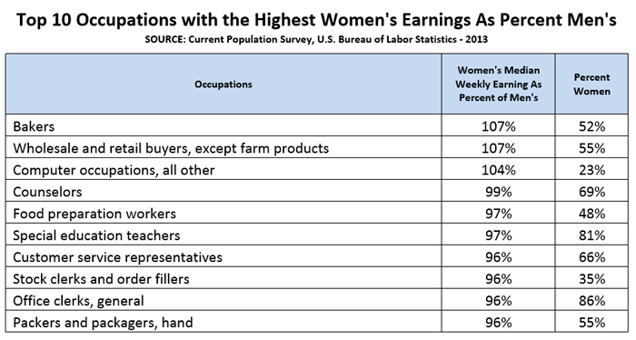
On the other side of the distribution among occupations, with the highest women's earnings as a percent of men's, in the table below in the bakers position, women's representation was 52% and their earnings were 107% of men's earning, or women earned 7% more than men. In the hand packers and packager's occupations, women's representation was 55% and their earning was 96% of men's earning.
Through the descriptions and the examples above I have tried to show that using publicly available data in the gender wage gap debate has its benefits and drawbacks. Publicly available data is useful in showing the overall trends. With the help of publicly available data we see that the gender wage gap has narrowed since 1960's but we also see that in recent years the narrowing of the gap appears to be diminishing. We need to watch this trend to see if this recent slowdown in the trend is a short term phenomenon or indicates a systematic change in the market. The drawback for using the publicly available data for analyzing the gender wage gap is that the data usually is not rich enough for reaching defendable conclusions on why such observable gaps exist. To conduct such analyses one has to use micro level data and compare similarly situated subjects and control for confounding factors such as occupation, industry, work experience, job tenure, and other factors that affect career choices.
Employers usually are in a better position to conduct micro level analysis on compensation to make sure men and women who are performing similar roles in the company are paid the same. Employers usually have a rich set of data on their employees and they should be able to conduct defendable analyses that compare similarly situated employees. Employers should conduct salary audits and proactively monitor their compensation systems and if they find any gender-based pay differences they need to address those immediately.
1. This based on annual real median earnings of total workers and full-time, year-round workers. ↩
2. Blau, F. D., & Kahn, L. M. (2000). Gender Differences in Pay. Journal of Economic Perspectives, 14(4), 75-99. ↩
3. See "Median weekly earnings of full-time wage and salary workers by detailed occupation and sex", Current Population Survey (CPS), 2013. http://www.bls.gov/cps/cpsaat39.htm ↩
4. The reason this ratio is higher than then famous ratio of 77% is that the 77% includes annual earnings which means it includes a broader categories of the earnings, for example earnings of part-year workers. ↩
5. The note in the bottom of the table 39 indicates that either the data for some of the occupations was not available or the number of subjects in that occupation was less than 50,000. ↩